
 This update for the Life is Feudal: Your Own Livemap comes with a vast amount of small changes and design enhancements along with a sticky bar on top to display the player count, restart timer and functional icons.
In order to prepare for future features I really needed a place to put icons or buttons and display general server status information. The first approach was placing the icons in a sidebar. It looked okay and worked well but it seemed to be impossible to display the server status information in a sidebar properly. So it moved to the top eventually.
Design and Configuration Changes
If you take a look at the config.php file, many things have changed. I added better comments on top of each line to explain what the option is about. The file was divided in three sections: Connectivity, Features and Customization. The last sections contains a couple of new options that allow for color and design changes. Take a look.
### Website background color
const COLOR_BACKGR = "#0E283D";

### Guild name-label color
const COLOR_GLABEL = "#FFFFFF";
### Guild claim circle color
const COLOR_GCLAIM = "#FFFF00";
### Guild claim line thickness (in pixel)
const WIDTH_GCLAIM = 1;
### Guild claim line style: solid / dotted / dashed
const STYLE_GCLAIM = "solid";
### Tooltip box style: standard / dark / alert
const STYLE_TOOLTP = "standard";
 With these 6 options you can change:
- Website background color
- Guild name text color
- Guild claim color
- Guild claim line thickness and style
- Guild claim tooltip box design
If you aren’t familiar with color hex codes, you can easily generate them over at colorpicker.com. In the example on the right you can see a cyan (#00FFFF) claim with a line thickness of two pixel and a ‘dotted’ outline. It’s also using the ‘dark’ tooltip style.
 In this example I used a negative image of the map graphic to make it look really fancy. It’s using the ‘alert’ tooltip style, a three-pixel ‘solid’ outline, a dark red (#9C0000) claim color and black (#000000) guild name.
Just play around with these values until you’re happy with the result. There’s nothing you can break. If shit really hits the fan, you can always revert to the default configuration seen above.
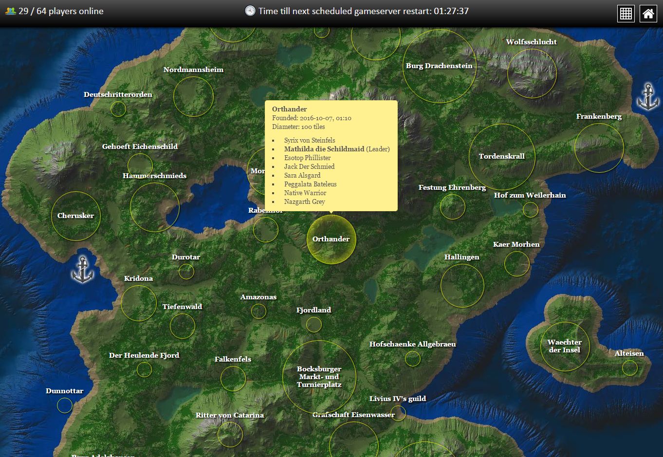
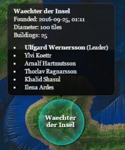
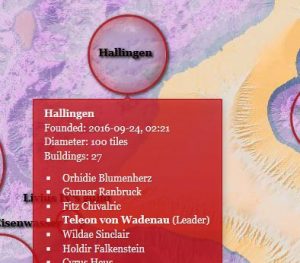
Maybe you’ve noticed that some guild names appear inside the claim instead of on top of it. This happens only if the name fits inside the claim without breaking a word or overlapping the claim border, cause that would look pretty bad. In addition, guild names that are displayed on top won’t have linebreaks anymore.
Experimental CMS support
Some people may want to include the map into their existing Content Management System (CMS) such as Joomla or WordPress. The problem with these is their way of rewriting URLs. It’ll cause the browser to request external files from the wrong location eventually and won’t be able to find them. I’ve implemented an experimental switch in the config.php:
const REWRITE_URL = FALSE;
If your CMS is causing trouble, try enabling it by changing FALSE to TRUE. I appreciate any feedback if it solved (or didn’t solve) your problem.
Full Changelog
- Added sticky bar on top of the page to display server status and buttons
- Moved the grid toggle link into the top bar
- The grid is now disabled by default
- Added a button for the servers website (set URL in config.php)
- Guild names are placed inside the claim circle whenever suitable
- Guild names that are placed on top won’t linebreak
- Guild claims are highlighted on mouseover
- Guild claim color, outline thickness and style are configurable
- Guild claim tooltip style is configurable (3 styles so far)
- Website background color is configurable
- Online players counter refresh lowered to 12s (from 15s)
- Added experimental support for CMS inclusions